In the last couple of weeks we've explored what responsive website design is and why you need it, so this week we're going to share with you some of the worst "responsive" stuff we've come across in the last couple of years.
This isn't a name and shame campaign but a 'buyer beware' so you can check your prospective web agency's work before you part with your cash. We've seen countless supposedly "responsive" websites out there making these mistakes. There is no half-way-house with making sure your website works effectively on a multiple devices. Any one of these could be enough to turn your potential customer off, or in the worst case scenario, make it impossible for them to use your services on-the-go.
In order to spare any blushes, we decided to break OUR OWN website to show you these horrendous examples. We had a shower afterwards. Please rest assured that if you visit this site on your mobile device, laptop, or 4K monitor screen, you won't experience any of these bloopers below.
Are you ready for us to dish the dirt? Here are the 7 deadly sins of responsive website design...

1. Making “some stuff” responsive
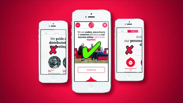
Placing a width: 100% parameter on the container of your website will make it shrink to fit any device width.
This is not responsive design. What happens in this situation is that everything shrinks: the site, the text, the images, the links. Now the site is unusable and it won't pass Google's mobile test - so not only will it be useless to humans with tiny fonts and unreadable content and images too small to make sense of, but Google will penalise you in your search engine rankings too.
You could've done a great job re-formatting the content for the screen size being used, making the site easy to read, and really nice and usable... but you just sent your user to pinch and zoom hell.

2. Shrinking the site
The second argument for why you need responsive website design is because you should love your website's users. When you make things easy for your users they reward you by spending more time on your site. If you're selling products, then it's a given that a user who enjoys the experience of visiting your site is more likely to part with their cash. Designers have been banging on about the importance of the right images, design and branding and strong visual communication for years - but in website design it has taken some time to convince both traditional web developers and their clients that your users simply won't stand for shoddy experiences any more. A website isn't a poster - it's a user interface which requires interaction. And that's why your site needs to respond.
So - we now understand that we have to analyse what users actually do on a website, how they behave, how they interact with the different elements, and that should actually determine how the design should function. A good user interface should not make the user have to think, and should make completing user goals as simple as possible. But the trouble with users is that you never know what they are going to do next. Web design companies spent years refining user experiences all across the web for desktop users and what did users do to thank us? They all went out and bought tiny little hand held devices with internet browsers on them and then complained when our beautiful websites no longer worked on them.
But rather than resist it, web companies had to embrace it, and quickly, as we all realised it just opened up countless new opportunities for you that didn't exist before! Designers now had to find a way to create a new user experience for mobile devices to keep those users coming back for more, and not struggling trying to view these desktop optimised sites. All this old pinch to zoom nonsense is a pain, and pain for your users results in no gain for you. It takes 10 seconds maximum for someone to get frustrated and go to a competitor's site instead. Responsive website design gives us a way to refine the look and feel of a website and to craft an alternate user experience for a device which - let's face it - couldn't be further removed from sitting at home in the study with the trusty desktop PC with a keyboard and mouse! If you love your users and treat them well, they will love you back and reward you with traffic, data and sales. Ignoring this won't make it go away. Just your customers.

3. Using ancient HTML
Using HTML tables to create layouts is the practice of dinosaurs. If you're not a dinosaur (and more importantly, if your customers aren't!) then don't let a dinosaur anywhere near your online presence.You'll need a web designer or developer who uses the latest HTML best practices. Using the correct markup you can create proper web components that can float (i.e. move around and 'flow' when screen sizes change), display as block or inline-block (i.e. always starts on a new line and takes up the full width available), inline (does not start on a new line and only takes up as much width as necessary) or even better adhere to a full 'responsive grid' framework (i.e. splits the screen into different numbers of columns of content depending on screen size).
There's also a chance that future versions of popular browsers won't even render your site's old fashioned code properly on ANY device, even desktop screens.
Make sure your web developers are up to speed with the latest coding techniques or you'll spend your money on something that's already gone out with the ark before you've even launched it.

4. Not resolving horizontal scroll
Sometimes there will be a stubborn element somewhere on a given web page that just loves to cause a horizontal scroll.
It can be a very frustrating and time consuming task to find the offending element and correct the applicable code to prevent that horizontal scroll which makes your users have to scroll left or right, sometimes away from all the core content of your web page, and into some sort of Matrix-esque white space.
Not to mention it looks amateurish, which reflects on your brand. This issue happens to the best of us, but a good web designer spends the time to put it right. A lazy one will pretend they haven't seen it. A bad one won't even spot it in the first place. Don't accept this happening on your website - ever.

5. Not using equal heights in grids
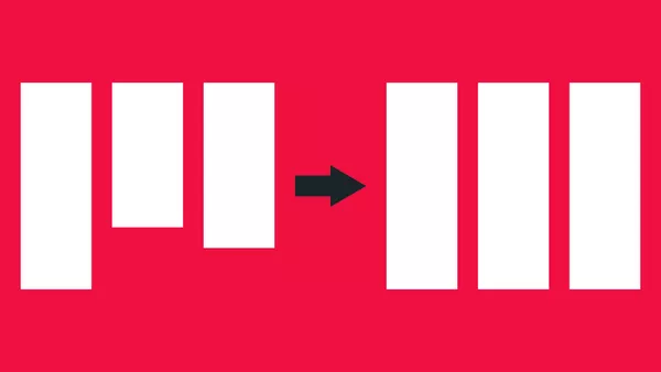
Sometimes when creating responsive designs, grids can go horribly awry. Imagine a grid of eight items displayed as four columns and two rows on a desktop display. Item 3 is displayed in row 1 and column 3. However, on a tablet the grid must re-flow using the responsive grid's 'tablet' breakpoint, for the layout to better suit the screen size. A good fit would be two columns and four rows. Item 3 will now be displayed in row 2 and column 1. And this will alter again for a smaller screen size. Without the proper understanding of what is happening we can end up with horrid “stepped” grids which look really nasty! Of course there are intentional uses of the stepped grid such as you see on Pinterest but I can assure you that design has been very well considered and isn't an accident.
To resolve the issue we use some clever coding which applies equal heights to every item in a given row, based on the tallest item in that row. When a given breakpoint is reached and the grid responds accordingly, the item heights are all immediately re-calculated depending on the tallest item in their new row.

6. Not resolving padding, margin and overlap issues
Often padding and margin will need adjusting for different breakpoints. Naughty designers will ignore this and you can end up with a horrible display of uncalculated white space, both inside and between elements. Remember white space is only beautiful when it's meant to be there.
Overlaps can occur when CSS 'floats' (which are what allow elements to flow around a page at different sizes and breakpoints) break horribly when you switch between breakpoints. What happens is all of a sudden elements lose their height properties and everything inside of them and around them collapses over the top.
What you end up with is element overlap which not only looks really rubbish but also totally screws up the flow of your web page. It's amateurish, confusing, and just plain nasty.
Designers that don't test for these issues or even worse - spot them but refuse to put them right are just not worth your time or money.

7. Taking away a useful component for smaller screens
This last sin is the one which some naysayers might throw at you as an argument for not bothering to have a responsive website. But if you've read the first two parts of this series - you'll know exactly why this is nonsense.
Bad web designers do something very naughty when they have an element they don't know what to do with at a smaller screen size; they just get rid of it. Delete it.
If there's a really useful sub-menu when you view your site on a desktop machine or laptop, then it really needs to exist when you view it on your mobile too. Making your website responsive for mobile doesn't mean making it less usable. The WHOLE POINT is to make your site MORE usable on a smaller device.
So unless an element is truly unusable on a mobile device (such as a landscape map with tiny links on it for example), you really need to keep it in there, somehow. Or display an alternative that solves the same problem the original feature or function does on the larger screen sizes. This is where real skills and experience come in. It's all about re-working the flow of a page to work on a mobile device; not just deleting elements willy-nilly because you can't be bothered to think about where things should go.
Basically, if you don't have a VERY GOOD REASON for deleting it, don't delete it - re-format it, re-work it, or re-factor it!

Join me next week…
Phew. What a journey we've been on.
In the last three weeks we've covered what responsive is and why you need it, and now you know how to avoid throwing your money away with agencies who can't help you make the most of your site on all devices.
Next week is the last part in our responsive website design series and I'm going to be writing about some of the drawbacks of responsive and what we can do to overcome them. Hope to see you next week for that.
If you've heard enough and want to start talking to us about your requirements contact us today so that we can help bring real success to your online presence.


